Monday, 29 June 2026
Monday, 29 June 2026
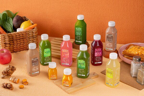
The redesigned bottles, featuring minimalist labels, put the vibrant colours of the juices front and centre, reflecting the natural beauty of the fruits and vegetables within Re.juve Cold Pressed Juice,…
The redesigned bottles, featuring minimalist labels, put the vibrant colours of the juices front and centre, reflecting the natural beauty of the fruits and vegetables within
Re.juve Cold Pressed Juice, a pioneer in Singapore’s cold-pressed juice industry, marks its 10th anniversary with the unveiling of a fresh and innovative bottle redesign. Reflecting the brand’s core values of health, transparency, and simplicity, the new look enhances both the aesthetic and functional qualities of Re.juve’s juices, making it easier for health-conscious consumers to appreciate the purity and natural goodness inside each bottle.
Since its founding in 2014, Re.juve has expanded to over 100 stores across Singapore and the region, continually perfecting its craft. Each bottle contains 100 per cent fresh ingredients, free from added sugars, water, concentrates, or preservatives—just pure, raw nutrition.
The redesigned bottles, featuring minimalist labels, put the vibrant colours of the juices front and centre, reflecting the natural beauty of the fruits and vegetables within. By retiring the familiar fuchsia logo, Re.juve allows the bold, natural hues of each juice to speak for themselves, making it easier for customers to identify their preferred flavours and health benefits at a glance.
“Our new packaging is a celebration of simplicity,” said Nicholas Johannes, Director of Re.juve Cold Pressed Juice Singapore. “The redesign puts our customers first by emphasising the raw beauty and health benefits of our ingredients. The clean, straightforward design is a reflection of the honest, transparent products we’ve been crafting for the past decade.”

Jun 29, 2026 | Australia

Jun 29, 2026 | Australia
Jun 26, 2026 | Company News

Jun 18, 2026 | Company News

Jun 29, 2026 | Australia
Jun 29, 2026 | Beverages